
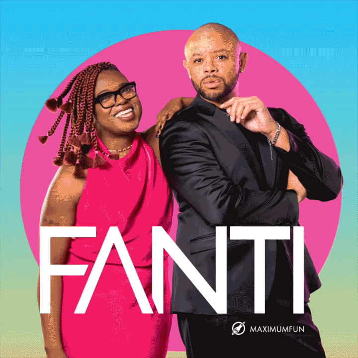
Fanti podast
I’ve had the pleasure of contributing to the Apple Award-winning podcast FANTI for three seasons, but this most recent season was by far my favorite. For the first time, I was fully trusted with the creative vision—from pre-production through post. I played a hands-on role in developing the concept and bringing it to life, leading the creation of a bold, bright, and colorful visuals that captured the energy and spirit of the show.
the pitch
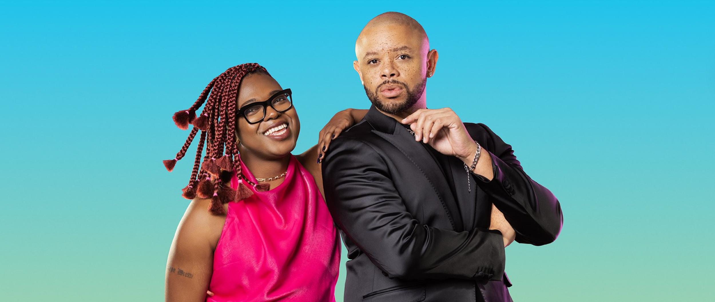
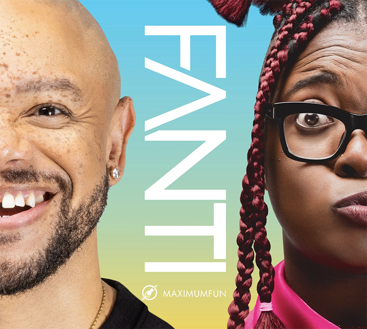
FANTI’s primary goal for Season 4 was to refresh its visual identity while increasing crowdfunding and partnership opportunities. The rebrand pitch was grounded in research, current design trends, and a modest budget. We proposed a clean, simple, and commercial visual approach—using photography and videography that highlights what listeners love most: the hosts.
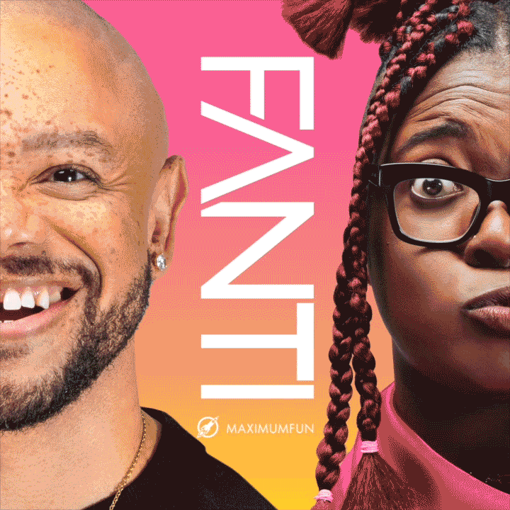
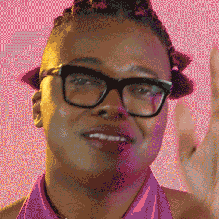
We leaned into bold, colorful, high-quality imagery to create a sense of intimacy and connection with the audience. The visuals were designed to work across multiple formats, allowing for tight macro crops and versatile use across platforms.
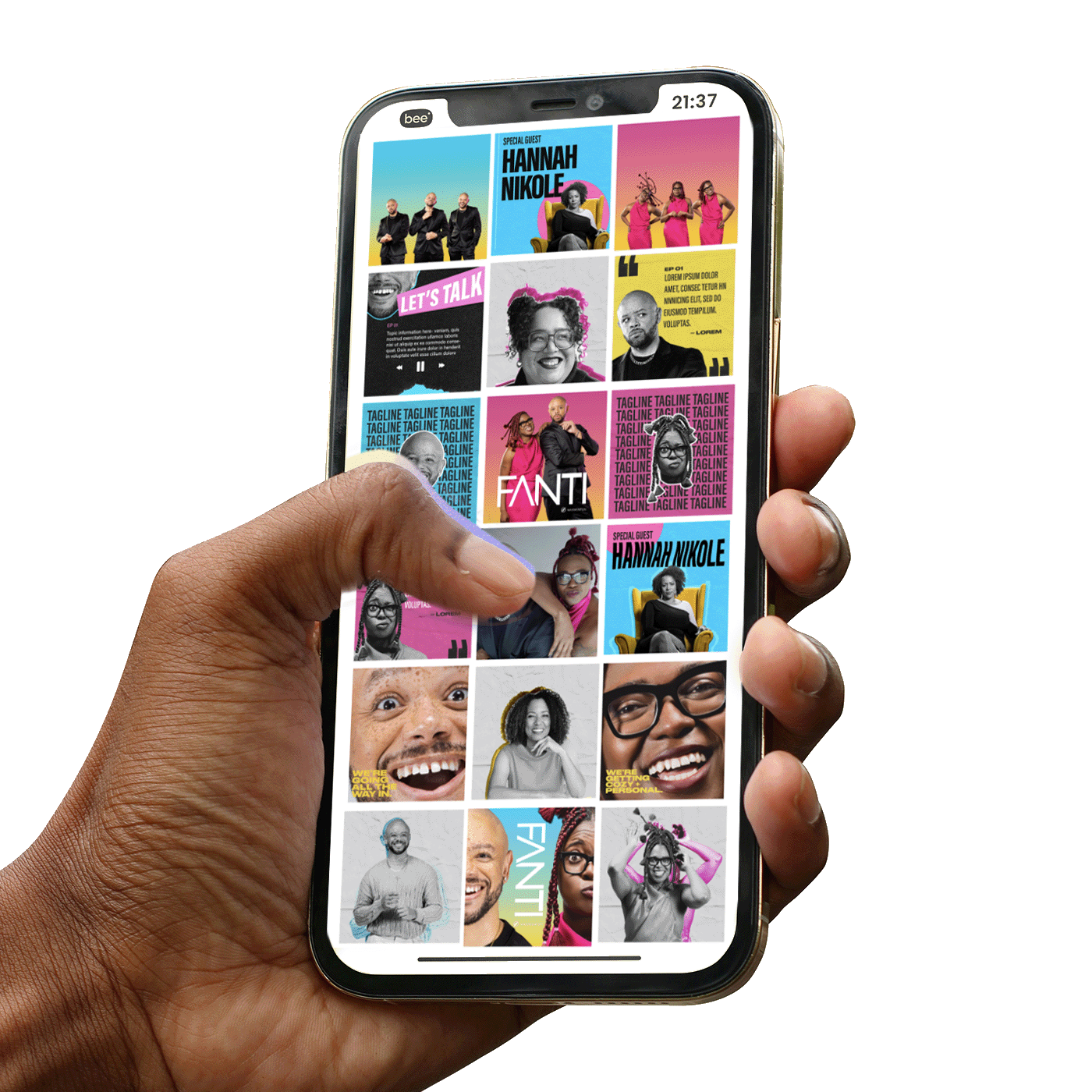
To add further value, we delivered a package of clean, easily repurposable assets for social media, future brand deals, and partnerships.
The details.
FANTI, journalists Tre’vell Anderson and Jarrett Hill bring their pop culture and political expertise to things they stan and stand up against. FANTI is a place where nuance reigns supreme with energetic, complicated, and sometimes difficult conversations that bring deep knowledge and thoughtful perspective to the things we love and rage about, from the White House to the Real House(wives).
Thousands of reviews note the vibrance and excellence of the FANTI hosts and the joy that the podcasts serves. Listeners tune in weekly because jarrett & Tre'vell's dynamic shines bright, no matter how dark the topic of discussion.
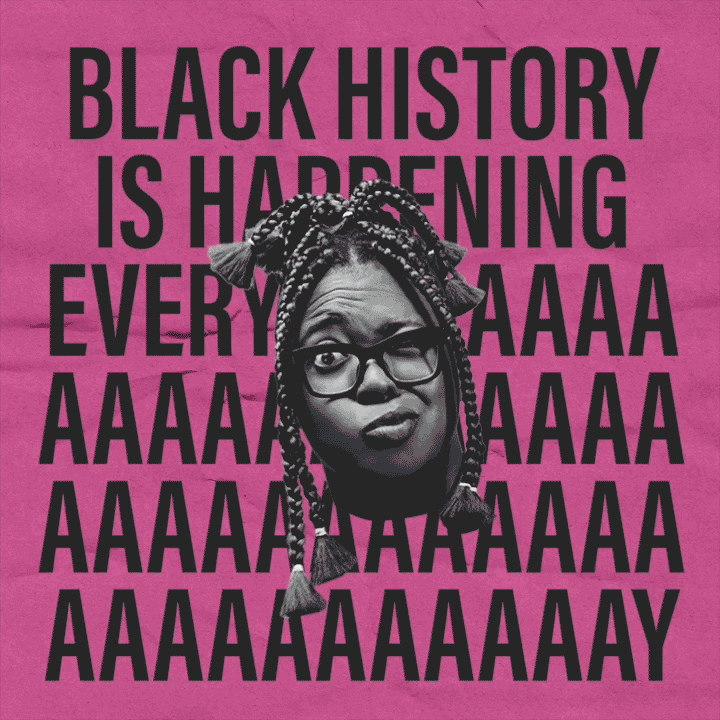
The birth of the pod was during the pandemic — a dark time. We lightened it up and added some color to the podcast that paints a perspective on the “grey areas of our lives”.
The visuals.
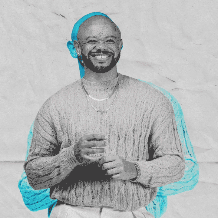
To honor the host’s journalistic roots, we incorporated paper textures and a palette of black, white, and CMYK tones directly into the shoot and visual assets — a subtle yet thoughtful nod to print media.
For social media, we focused on longevity. We delivered comprehensive font kits and layered graphic templates with ample negative space, empowering their in-house design team with versatile tools to build on the visual identity long after launch.
.
video by ruben samuel cortez